Increase your conversion with mega menus

The menu on a website is the heart of guiding your visitors to the right place in an effective way.
Create better conversions using your menu
With an easy-to-understand mega menu, you give your visitors more entrances and better conversion as they do not have to go through a maze of links, buttons, and pages. The steps from the first page view to purchasing are drastically reduced. This type of menu therefore also tends to keep the visitor longer on the page.

What exactly is a mega menu?
Mega menu is a type of drop-down menu where a larger number of links can be displayed in a large drop-down layout. It is a solution that excels for menus where many options are to be displayed.

A mega menu solves many of the problems that exist with a traditional dropdown menu. In this type of menu, it is possible to display several levels of the web site’s information architecture at the same time, something that can be difficult to achieve with a traditional menu.
The potential of a mega menu
Mega menus can be suitable for many types of websites, whether it is a small newspaper page or a large e-commerce page. The idea is to make broad content easily accessible.
You can neatly group entrances using headlines, leading buttons, and texts to direct visitors’ attention to a specific offer or area of your site. For example, it could be a new campaign or a page with carefully selected articles that do not fall under the regular entrances.
Here are some examples where you can use mega menus to your advantage.
- Extensive menus for wholesalers
- Larger category menus for e-commerce sites
- Selected content in the menu on newspaper pages
- Visually appealing menu for company pages
- Selected campaigns in the menu for e-commerce sites
In the majority of cases, a megamenu is preferable for e-merchants. For us, the implementation of mega menus in our solutions is obvious and an opportunity for you as a website owner.
In our e-commerce solution Qala, we have chosen to apply a relatively balanced mega menu as a basis. You can see how Qala’s megamenu is used in some of the examples below.
What it might look like
Here are some examples of how mega menus are used on different websites.
Category hierarchy + top seller
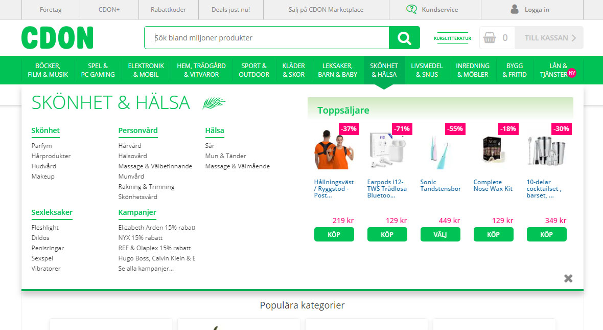
This example is taken from CDON, one of Scandinavia’s biggest e-commerce site. They use their mega menu to display categories and subcategories, along with a number of top sellers from the main category.
Models + Explore + Selected
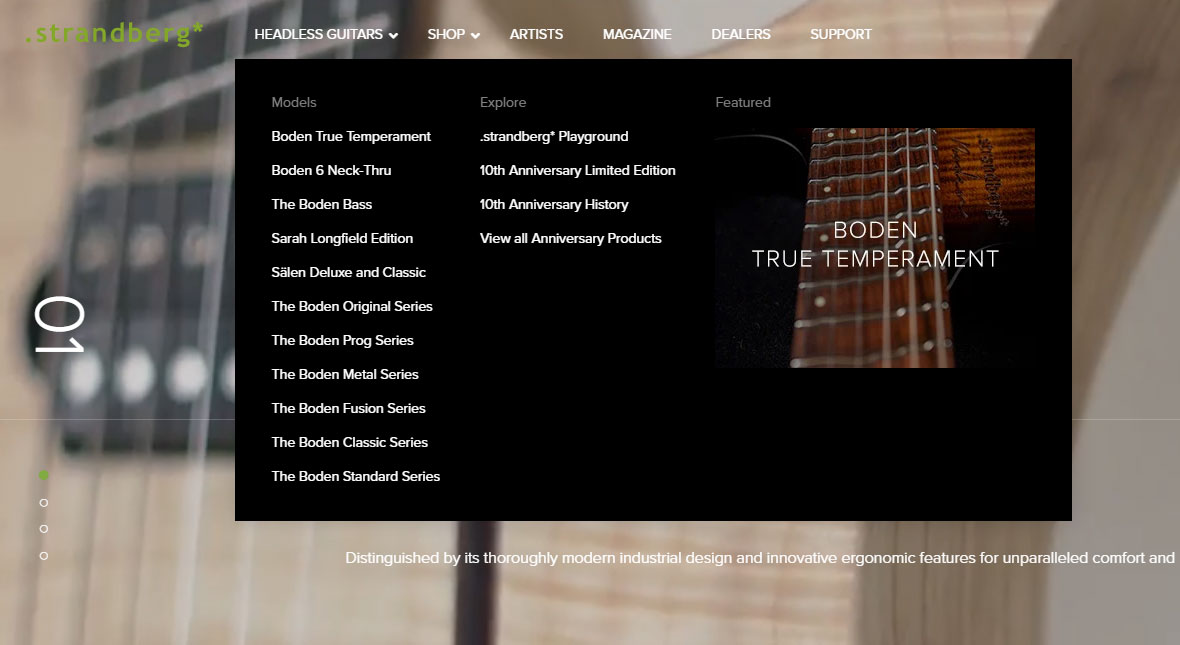
This is an example from .strandberg * that uses our e-commerce solution Qala. Here, a mega menu with a relatively compact layout is used to display subcategories and selected content as a more visual link.
Default menu + Call to action
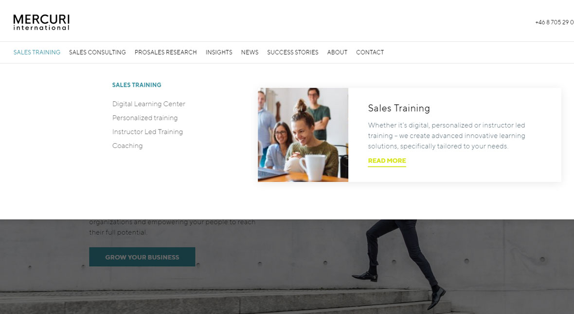
Mercuri International, which uses Qala as a CMS solution, has a mega menu with standard choices where they have also added a larger call to action to lead the visitor.
Clean efficient category layout
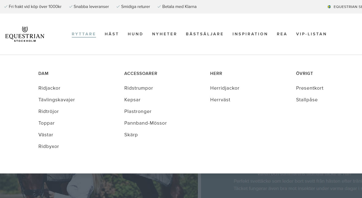
Another example, here of a cleaner but even more efficient layout of mega menu from Equestrian Stockholm. They also use Angry Creative’s e-commerce solution Qala.
Advanced vertical to horizontal
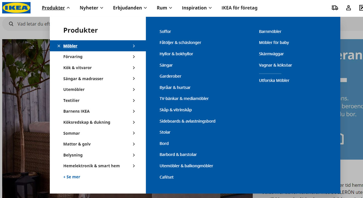
IKEA has a relatively advanced mega menu that is based on a vertical basic menu and that expands horizontally when clicked. An effective way to expose as many parts as possible, as easily accessible as possible when you have many menu options.
Worth considering
A mega menu can look different and present the page’s inputs in many different ways. However, one should be careful not to overuse this type of menus. If there is too much content, the visitor will feel confused rather than guided.
When a megamenu is applied, it is easy to want to add all the pages to your website as an option. Instead, make sure to use your sitemap, or user flow, as a guide when creating the structure. Also, avoid elements that require more intricate interactions than a simple click. The menu should be easy to understand and easy to use.
Are you ready to take the next step with Qala and Angry Creative?
Our e-commerce solution, Qala is created by renowned WordPress & WooCommerce experts. Qala has the most common features you need as an e-retailer along with a modern basic design. Book a demo today!
You may also be interested in these articles

Brexit for WooCommerce sellers
The impact of Brexit is huge. There are very many implications for those in e-commerce businesses…
Read moreBrexit for WooCommerce sellers

Cynefin: a valuable framework to classify, communicate and respond to tasks in digital projects
Cynefin. At Angry Creative we think it’s a vital part of digital projects. It helps us to underst…
Read moreCynefin: a valuable framework to classify, communicate and respond to tasks in digital projects
Web fonts for WordPress
Fonts control how your text is displayed – how the letters actually look. web-safe fonts. W…
Read moreWeb fonts for WordPress
Subscribe to our newsletter for tips, inspiration and insight about WordPress and WooCommerce and the digital world beyond.
Time to take the next step towards a more effective website?
Contact us, and we can talk more about how we can take your business to the next level together.