Last week our design team attended Reasons To – a design conference in Brighton.
Reasons To is a 3-day long conference with talks covering design, code and creativity. We’re incredibly lucky to have such a well-established design conference in our hometown. Our design team Rich, Tom Doidge and Jasper attended a day each and returned to the office inspired and with plenty to share.
Here’s our design team’s highlights from Reasons To 2016:

Rich Copping
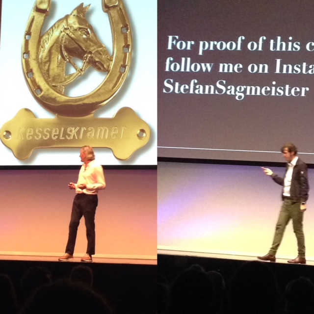
I was so impressed with the Reasons To event. The quality of speakers was incredibly high, world-class in fact. Stefan Sagmeister and Erik Kessels have been some of my design heroes since university, so getting to hear them speak (and in such a cool venue) was incredibly inspiring. Stefan’s talk was super interesting and you didn’t need to be a designer to appreciate his thoughts on the beauty of design, art and history. Erik Kessels (founding partner of iconic agency KesselsKramer) was a total rock star talking through his radical commercial work and his more controversial personal photography projects. You could really tell the organisers of Reasons To were super passionate about design and the Angry Creative studio was buzzing with inspiration from the event.

Tom Doidge
Reasons To 2016 boasted an impressive line-up of coders, designers, typographers and illustrators. No matter what your background, there was a talk to inspire you.
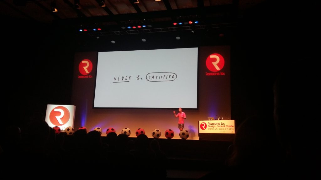
For me, Mr Bingo stole the stage on Tuesday. He walked us through the top 29 lessons he has learnt in his 15 years as a commercial illustrator. His talk was the perfect combination of inspiration, reassurance and humour. The slide which resonated with me was titled ‘Never be satisfied’. As creatives we should push ourselves out of our comfort zone and not be afraid to explore ideas, no matter how obscure they seem at the time.
Seb Lester, a local typographer from Lewes, gave us a great insight into his work and talked about how his personal experiences have shaped his career. Espen Brunborg, showed how adding a little bit of comedy into our web design can inspire the user, improve their experience and help with conversion rates.
I’m looking forward to next year!

Jasper Cheyney
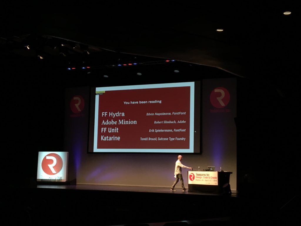
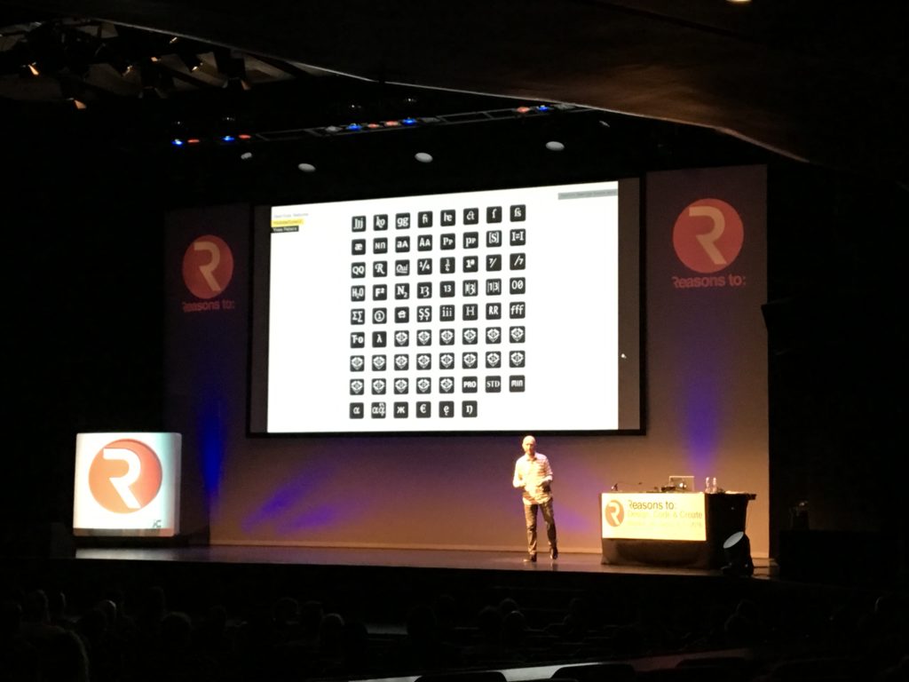
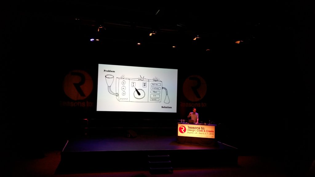
Yves Peters’ talk was my favourite. It was great, he discussed and analysed the most widely-used design application, Adobe Creative Suite. He looked at how the 15-year-old typographic interface within Photoshop, Illustrator and InDesign is outdated and unintuitive when compared to the multitude of options currently available. I wasn’t even aware of plenty of them, such as the multiple type-sets for each character within font families that are an OpenType (.otf) format. On top of that Yves presented numerous well-developed ideas and solutions to these User Interface problems to allow them to be better developed in the future.
