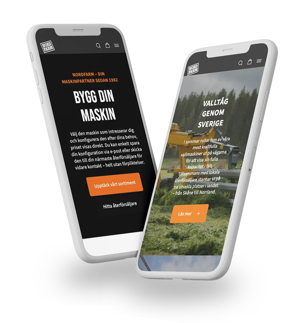
Nordfarm
Nordfarm. A digital B2B E-commerce platform that strengthens the business and dealer network. E-commerce Marketing…

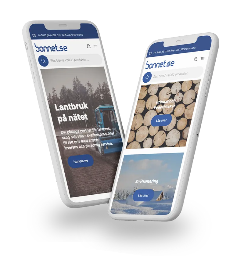
Bonnet
Bonnet. A digital e-commerce platform that went from fragmented to focused. E-commerce, Marketing.

Jens S
Jens S. High quality transmission solutions. E-commerce Marketing. Jens S. is a leading supplier of transmission solutions specializing in components…


Grand Union Housing Group
Grand Union Housing Group. Housing solutions for stronger communities. Marketing and promotion. Grand Union provides housing solutions and support services…

Fairtrade
Fairtrade. Fairtrade – Global justice and sustainability. MARKETING. Fairtrade is a global organization that promotes fair trading conditions for producers…

Plan International
Plan International. An international global charity. MARKETING. Plan International is an independent development and humanitarian organization that promotes children’s rights…

AddSecure
AddSecure. A fast-growing international business with a focus on security. MARKETING. AddSecure is a multinational company based in Sweden a…

RP
RP. Developing a future-proof e-commerce for an interior design company with a focus on sustainability

Strandberg Guitars
Strandberg Guitars. Seamless system integration for a guitar manufacturer’s E-commerce. E-COMMERCE, MARKETING.