Conversion optimisation
What is conversion optimisation?
Conversion rate optimisation (CRO) is the process of increasing the rate of conversions from a website or mobile app. CRO usually involves generating ideas for elements of your website or app that could be improved and then validating these hypotheses through A/B testing and multivariate testing.
When do we use it?
Conversion optimisation is carried out at the client’s request. When the website is not converting visitors into sales or leads as expected is when CRO is used.
Establish conversion statistics
Conversion rate optimisation starts by first identifying what the conversion goals are for a given web page or app screen. Success statistics for your website or mobile app depend on the type of business you’re in and what your goals are.
For example, if you sell products online, a conversion for you might be purchases or the number of website visitors who add a product to their shopping cart. If you sell products or services to businesses, you might measure the number of leads your website collects.
Some common conversion goals organised by industry type:
- Media – page views, ad impressions, newsletter subscriptions, recommended content engagement (these metrics already exist in analytics platforms)
- Ecommerce – product sales, cart abandonment, cart completion rate, newsletter sign-ups (these metrics require ecommerce conversions to be set up but are mostly already in analytics platforms)
- Travel – booking conversions, re-purchases, social media sharing (these metrics require an event to be set up on the website and sent to Analytics platforms where a goal can be created)
- B2B – leads generated, deals completed (these metrics require an event to be set up on the website and sent to Analytics platforms where a goal can be created)
These metrics should be set up to track a baseline of data collected in an analytics platform like Google Analytics. Once you have established the conversion statistics for your digital interactions with your audience, you can start trying to improve your digital customer experiences through conversion rate optimisation.
Getting started with conversion optimisation
All it takes to get Google optimise working on a website is to sign up for Google optimise, enter the account details and then put in the optimise tag ID from the script in pixelyoursite. You will additionally need to link your Google Optimise account to an Analytics property with a goal that you want to track. Once the goal is specified and the site is correctly tagged, the option will be available to change the site visually through Google Optimise and what percentage of visitors should be directed to the alternative version of the site.
Case studies
Case studies for CRO are difficult to define because the solution is spread across many areas. Looking at case studies helps to define the problem and apply the solution to other problems.
1. How Walmart.ca’s responsive design revamp increased conversions by 20%

Although responsive web design has become easier over the years, it can still take a lot of time and money to implement effectively. For Walmart Canada, it took almost a year to make their website fully responsive, but as their results will show – it basically paid for itself within months thanks to improved revenue from mobile devices.
Aftermath
Walmart saw a significant amount of traffic from mobile devices, mainly tablets, and realised that their current solution wasn’t really working on mobile devices.
There were two main problems: firstly, the overall look and feel of the site on mobile was terrible, secondly, it took forever to load.
So they set to work to make the overall experience faster and responsive to whatever screen size or device it was being viewed on.
Their previous analysis gave them plenty of data on which screen size and browser were used the most.
Implementation
Walmart used hands-on usability testing on both the old and new designs, A/B testing various elements and making overall speed improvements to the entire site.
The result with the new design, Walmart achieved an overall conversion increase of 20% on all devices. On mobile, orders increased by 98% – not bad!
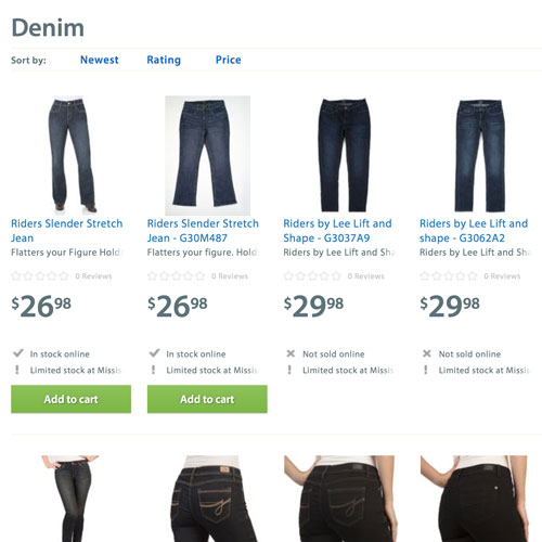
But perhaps the most surprising insight from the tests was linked to the presentation of product availability. By removing the ‘Show details’ button for products that were not available to buy online, they saw an increase in conversions.
Isn’t it interesting that the smallest things can make such a difference?
Actionable advice
- Walmart Canada saw that many visitors to their website were using tablets and then made the decision to opt for a fully responsive design.
- By getting rid of distracting buttons and other elements that don’t add value or help with conversions, by removing the “View Details” button, Walmart actually increased conversions.
2. Images outperform video, boost monthly revenue by $106,000
With all the talk about how explainer videos have the ability to increase conversions, it’s hard to believe that there are cases where a static image has the ability to outperform video – and as always, things aren’t always black and white.
After the fact
BrookdaleLiving.com offers various community solutions for retirees. Their first page was incredibly basic and had only the absolute simplest structure with no graphics, testimonials, or really any content at all that would encourage the visitor to convert.
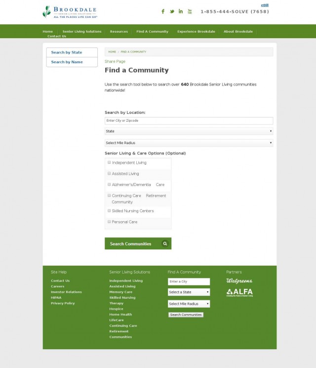
Brookdale hired Fathom to optimise their ‘Find a Community’ page. As there was little to work with on the current page, it was decided that a complete redesign was in order which includes adding more content, testimonials, credibility logos, USPs and the like.
Implementation
After a full redesign, Fathom came up with two variants that were tested against the original base page.
The first variant included a photo of an elderly woman. Like this:
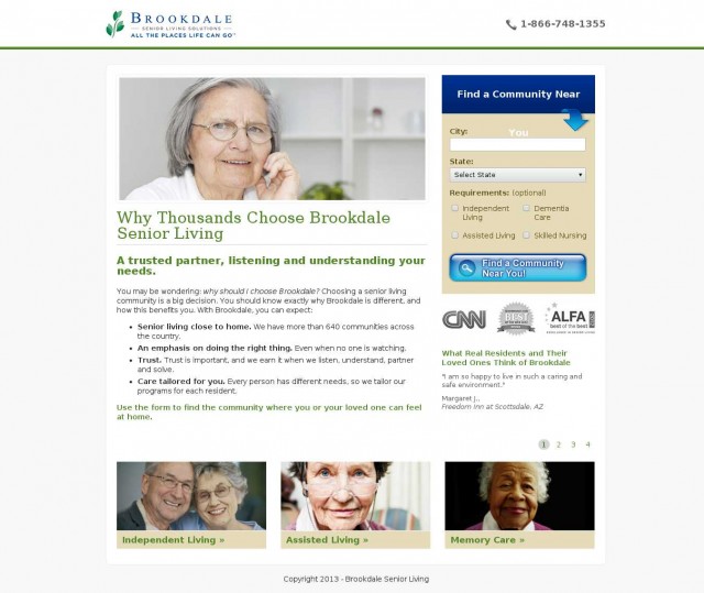
And the second variant had a video of 1 minute and 56 seconds instead of the photo. In the video, many older people talk about their positive experiences with Brookdale. Everything else remained the same.
After testing all three designs (the original and the two variants), it was found that the image version outperformed all others with a 3.92% increase in conversions, while the video only received a 0.85% increase compared to the original.
While the 3.92% increase may seem very modest, it resulted in a far from modest $106,000 in extra revenue for the company.
Why did this happen?
There are many possible reasons why these results are what they are, but Fathom and Visual Website Optimizer (provider of the testing software) share three likely reasons:
- Brookdale was already an established brand and the video served more as a distraction;
- Most of their users fell into the spontaneous customer type. Here’s a reflection by Matt from Fathom:
“We were wrong. We now understand our customers better: they’re not interested in marketing videos as much as they want to convert quickly and easily on the page”
- The target audience had a slower internet connection, so videos might not work for them.
According to Alexa data, Brookdale’s target audience is overrepresented by women who didn’t go to college, and according to various reports, people who didn’t go to college have slower connection speeds at home.
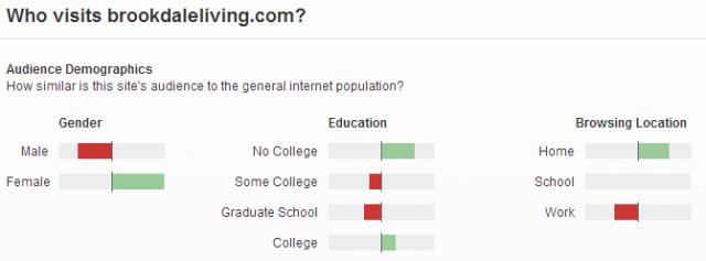
Another possibility is that older people are generally afraid of “new” things, or things that do something unexpected (like a video that plays automatically) and left the page.
Actionable advice
It’s all about really knowing and understanding your target audience and what they may or may not prefer.
Plus, data has the power to prove wrong all your instincts, gut feelings, intuition and the like. It doesn’t matter what you think, the results speak for themselves.
Need help optimising your conversion rate?
Contact us today to find out more about how we can help you reach your conversion goals.