
Apps VS Mobile customisation – When to use what?
Right now, there is a lot of talk about apps and mobile customisation. But when should you choose one over the other? And what do the different things actually mean? There are two popular ways to present material on mobile platforms: Mobile apps & Mobile-friendly websites. Here I will talk about when to use what.
Mobile apps
An ‘App’ is basically a programme that is created to run on a mobile phone. Apps are a fantastic way to create content-rich applications that utilise the maximum potential of the mobile phone. Many people have, in my opinion, completely misunderstood why you should have an app and thrown a lot of money on completely unnecessary apps. A good example of this could be DN . There DN has simply taken the paper newspaper and put it up digitally (Please read Per Thernström’s review of DN ). An app should not be used to feed people with material from one direction – DN’s readers could just as easily have gone to DN’s website if they wanted to read the news. Repackaging a website into an app is not a good idea – an app is there because you need advanced interaction.
However, there are times when your website has become so advanced that you actually need an app. Facebook is a great example. There you have a lot of interaction – I post pictures, write what I’m doing and talk to my friends. If you lack these interaction elements, the app becomes quite toothless. In short – you have to have a good idea for an app, otherwise there is no point in making one.
Then there is not ONE platform for mobile phones, and therefore you often have to write your application for both iPhone & Android. If you chose to make an iPhone application only, you would only reach out to those who actually have an iPhone – other mobile phones cannot access the content.
This is perfectly OK to do as long as you are in Sweden – here we are quite spoilt with cool electronics.
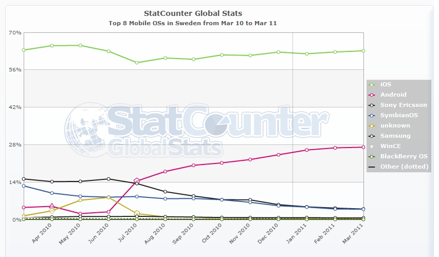
In the above graph of mobile operating systems in Sweden, we see that at the time of writing 63.11% use iPhone, and 23.12% use Android. However, the general trend is that Android is increasing incredibly strongly, and therefore we should see Android taking up an even larger market share in the future.
This means that our app only reaches 63.11% of those with mobile phones connected to the Internet in Sweden. But if you now think that you have a larger target group – let’s say the world – what does it look like?
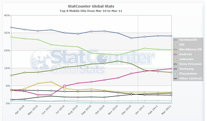
As you can see from the graph of mobile operating systems in the world, only about 25% of mobile devices are iPhone devices. Android accounts for 15%, and the most common is SymbianOS – i.e. older mobile phones. The majority of people in the world cannot afford to buy state-of-the-art mobile phones five times a year.
When should you use Apps?
Use:
- If advanced interaction is needed
- If you have flash content you need to display
Do not use:
- If you only need to get information & news out
- If you want to present the material on your website for mobile platforms
- If you want to reach as wide an audience as possible
Mobile-friendly websites
Apart from the app, the most popular approach to presenting mobile data is to make a mobile adaptation of a regular website/e-commerce solution. This is a very good way to get information out there that your visitors using mobile platforms can use. As long as you do not need advanced interaction, mobile customisation is preferable over the app as it is platform independent. This means we can reach out to everyone with a single solution!
There are two popular ways to do mobile adaptation: Either by using modern web standards and approaches like the Less Framework (this website uses a modified version of the Less Framework that I call Less) or by writing a programme that automatically detects when a visitor is using a mobile operating system. These solutions are usually added as modules to the website’s management system (CMS), which is why I will call them Module Solutions.
Mobile customisation with Module
Customising websites using a module is the most common way to make a mobile adaptation. The reason why it is the most popular way is that the popular administration systems such as WordPress, Drupal & Joomla have ready-made modules that you can download for free and adapt with a few clicks. By using a ready-made module, however, you get a standardised look, so it depends on how important it is to maintain the graphic profile in all situations. If you then have a different structure on your website than what the module is built for, everything falls apart, and then you have to rewrite the module. And if you don’t use either of these systems, it can be a costly affair, because you have to write everything from scratch.
When should you use Mobile Customisation with Module?
Use:
- If you want to present information so that everyone can access your content
- If you want a cheap alternative
- If you only need to get information & news out there
- If you want to present the material on your website for mobile platforms
- If you are not prepared to modify your regular website
Do not use:
- If your graphic profile is important
- If you have flash content you need to display
- If your information architecture does not look like a standard installation
- If advanced interaction is needed
- If you need to distinguish between mobile phone & tablet
Mobile customisation with Less Framework
A template customisation with for example Less Framework is a relatively new solution. However, it has the advantage that you can easily change the customisation as you go along. Another advantage is that you get total control over how things are displayed on different platforms. The mobile phone has its modes, the tablet has its modes and the computer has its modes.
The main difference with the module is that here you can maintain the graphic profile in a good way, and each website’s mobile/tablet adapted mode becomes unique. It also doesn’t matter how you solve your information architecture, because all you really do is “repackage” the regular content on your website.
Since you “just” repackage the content of your website, it is also quite possible and (relatively) straightforward to add new modes for different types of machines in the future, but you can also customise your current website for one platform at a time. The downside is that each mode has to be designed, and if you have interaction elements that were not intended to work for mobile platforms (for example, menus that you have to hover over to work), you have to modify properly on the regular website.
When should you use mobile customisation with Less Framework?
Use:
- If your graphic profile is important
- If you want to present information so that everyone can access your content
- If you only need to get information & news out there
- If you want to present the material on your website for mobile platforms
- If your information architecture does not look like a standard installation
- If you need to differentiate between mobile phone & tablet
Do not use:
- If you have flash content you need to display
- If advanced interaction is needed
- If you are not prepared to modify your regular website
Bottom line
Getting an app is not for everyone. If you have an idea that requires advanced interaction, you should have an app – not otherwise. If you do not have this, but the purpose is to present the material from your website / newsletter, you should instead invest in a mobile-adapted website. This can be done in two ways; Either by adding a module to your administration system or by adapting your current website. All methods have their advantages and disadvantages, and you should know the advantages and disadvantages of the solution you choose.